Delft Mapper
A web-based mapping platform for urban professionals, allowing them to display, combine, and toggle multiple datasets in real-time for the Municipality of Delft.
Role:
UX/UI Design · User Research · Prototyping · Client Communication · Scrum Master (shared)
Project Overview
DelftMapper was a semester-long project for the Municipality of Delft, created as part of the Smart Society User Experience Design course. The tool is a web-based mapping platform for urban professionals, allowing them to display, combine, and toggle multiple datasets in real-time. With its interactive timeline, users can scroll through years of data to see both historical context and future plans. The tool enables professionals to spot overlaps, address conflicts, and collaborate directly through online discussion threads. We worked using the SCRUM framework with weekly sprints, rotating the Scrum Master role each week to practice both planning and facilitation across the team.
The Challenge
Urban development projects in Delft involve many stakeholders and complex datasets. Professionals currently rely on fragmented GIS tools that are powerful but difficult to use, or on static documents that lack interactivity. The municipality challenged our team to design a user-friendly tool that would bring these data sources together in one interactive platform, while also fostering collaboration.
Key Challenges:
- Simplifying professional GIS complexity into an accessible interface
- Supporting multiple layers of data visualization (maps, charts, statistics)
- Providing tools for discussion and collaboration across stakeholders
- Creating a scalable prototype aligned with the municipality's brand identity
Research & Define
Our team began with benchmarking existing tools such as QGIS, ArcGIS Online, and pdok.nl. We identified both powerful features to draw inspiration from (layer management, dashboards) and pain points to avoid (steep learning curve, cluttered UIs).
We also conducted interviews with potential users, including urban planners, students, and municipal advisors. Key insights included:
- Users wanted clarity and simplicity over feature-heavy complexity
- Collaboration was missing in current tools, but considered essential
- A visual timeline would help planners understand historical context and predict overlaps

Benchmarking comparing various platforms to identify strengths to adopt and pain points to avoid.
Design Process
We worked in sprints using a Scrum framework:
Sprint 0 – Research & Define/h3>
- Conducted benchmarking and interviews
- Defined user stories, product vision, and design problem
- Delivered initial concepts to the client
Sprint 1 – Ideation
- Used creative techniques like "the dark side" and brainwriting to generate ideas
- Consolidated two initial concepts into a single vision
- Produced early wireframes and presented to client for feedback
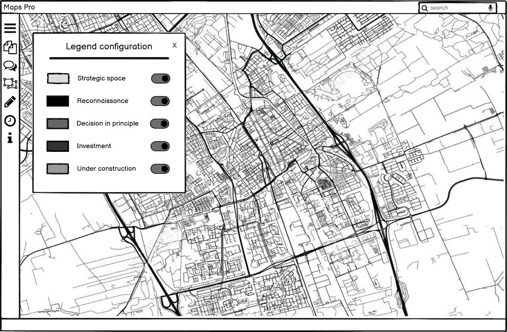
Early wireframe showing the initial interface layout and navigation structure
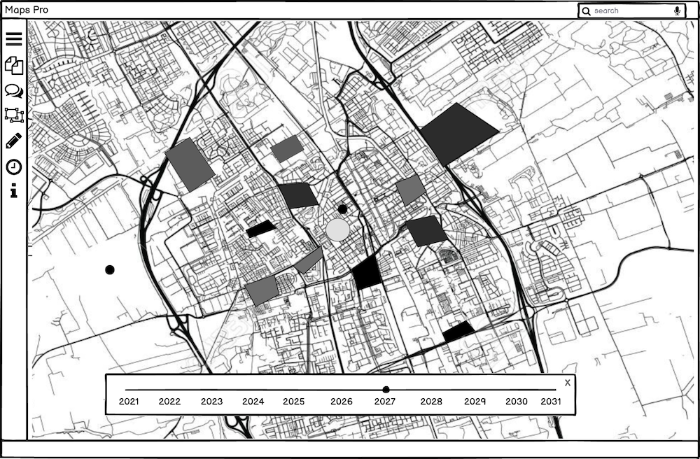
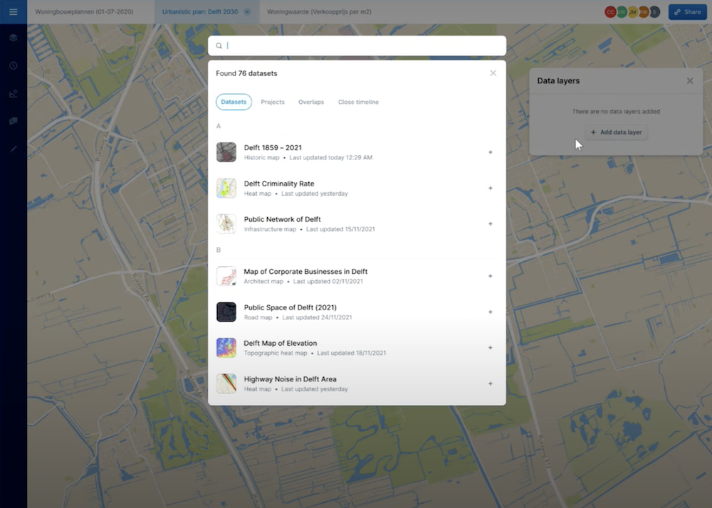
Wireframe exploring different data visualization approaches and layer management
Sprint 2 – Prototyping
- Built mid-to-high fidelity wireframes for key features: timeline, overlaps, search, and statistics
- Developed a moodboard and style guide consistent with Delft's branding
- Delivered interactive prototypes to client
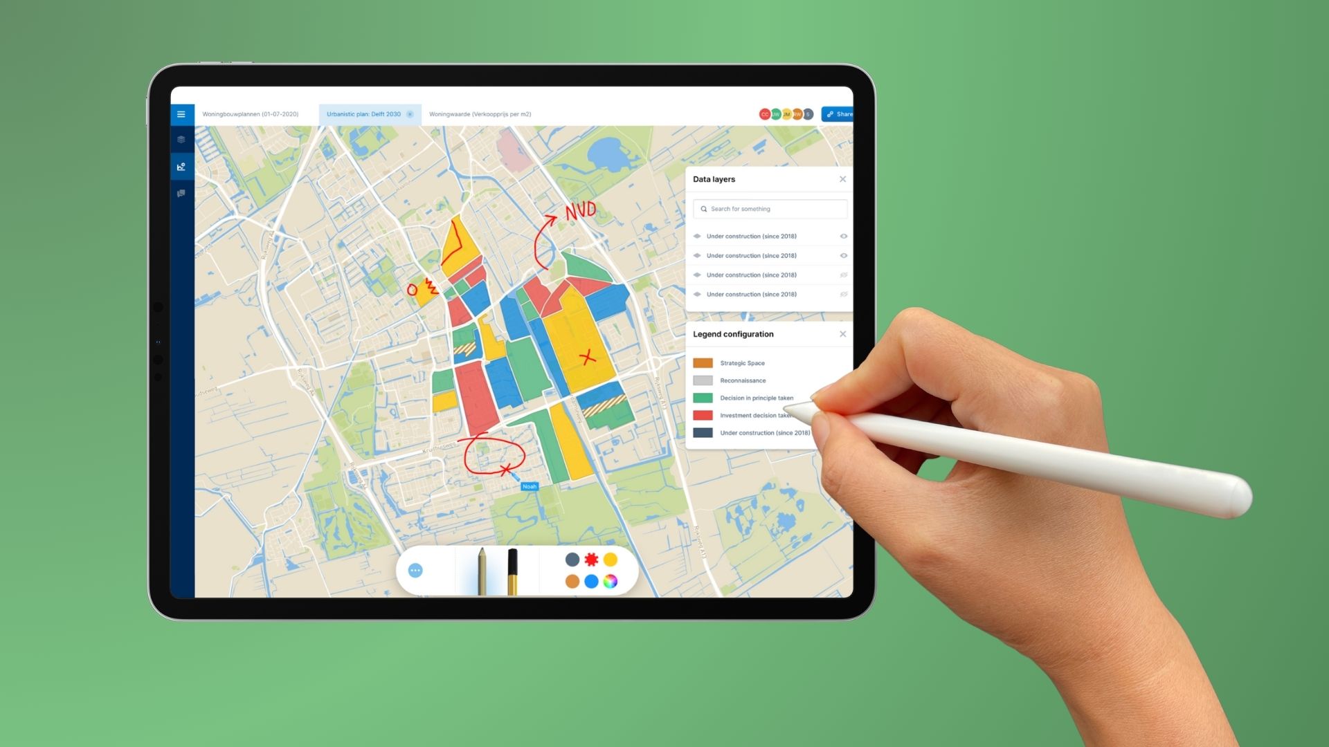
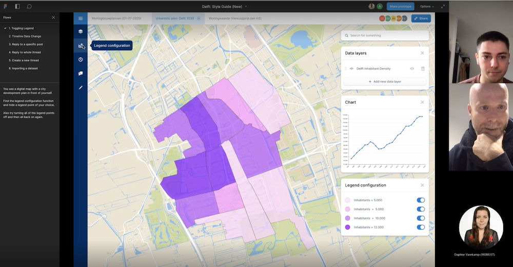
High-fidelity prototype showcasing the interactive timeline and layer management system
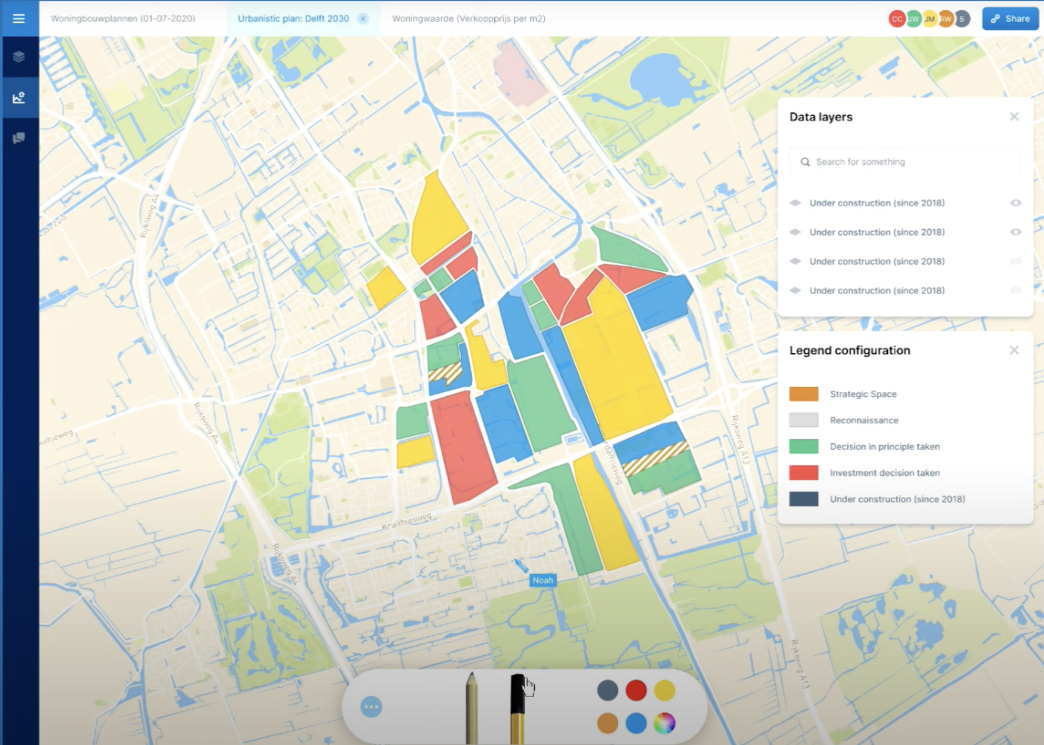
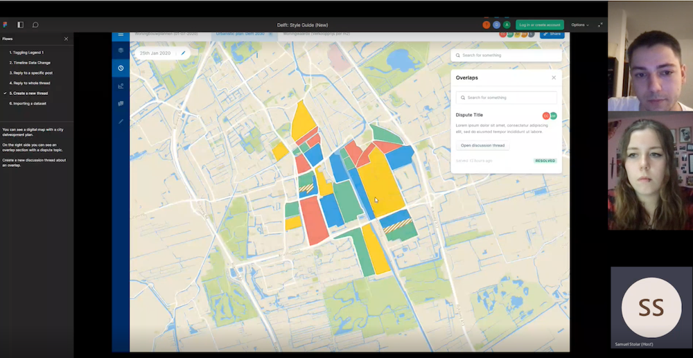
Prototype demonstrating data visualization styles and collaboration tools with discussion threads
Sprint 3 – Testing
- Added features: data importing, visualization styles (heatmaps, bubble charts), sketching, sharing, and discussion threads
- Conducted usability tests with urban design students, municipal advisors, and UX lecturers
- Refined based on feedback (improved legends, ability to reopen threads, added amenities view)
Screenshot from testing session with respondent #1: Ruud Brok, Architect & Design Lecturer
Screenshot from testing session with respondent #2: Samuel Stolár, Urban Design Student
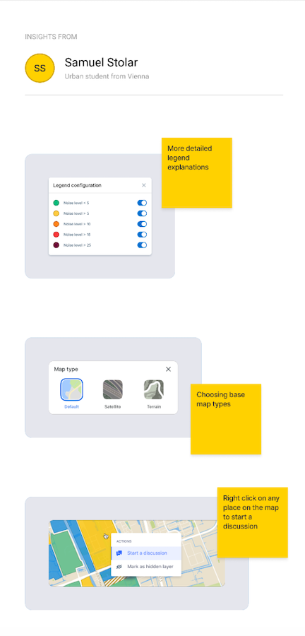
Key insights captured during testing: clarity of legends, desire for quick layer toggles, and prominence of timeline controls.
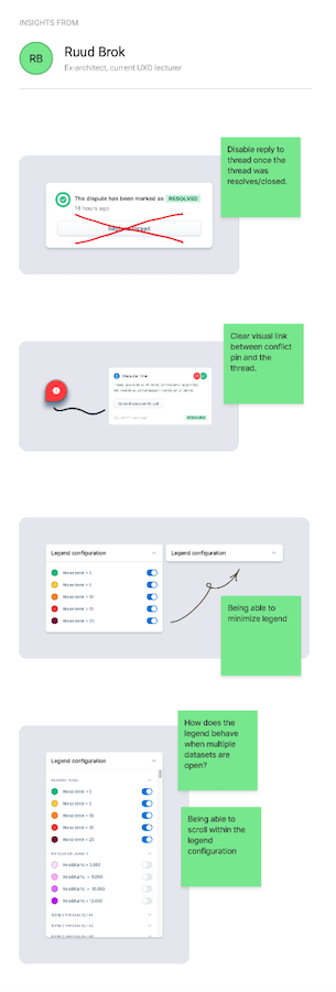
Follow-up improvements: added reopenable threads, refined color scales, and amenities overview for faster comparisons.

Early wireframe showing the initial interface layout and navigation structure

Wireframe exploring different data visualization approaches and layer management

High-fidelity prototype showcasing the interactive timeline and layer management system

Prototype demonstrating data visualization styles and collaboration tools with discussion threads

Screenshot from testing session with respondent #1: Ruud Brok, Architect & Design Lecturer

Screenshot from testing session with respondent #2: Samuel Stolár, Urban Design Student

Key insights captured during testing: clarity of legends, desire for quick layer toggles, and prominence of timeline controls.

Follow-up improvements: added reopenable threads, refined color scales, and amenities overview for faster comparisons.
Exposition & Final Delivery
Presented the prototype at Delft City Hall during the Smart Society exposition. Produced a final poster, video demo, and gave live demonstrations to stakeholders.
Watch the final presentation and demo of DelftMapper at the Smart Society exposition:

The Solution
The final prototype included:
- Interactive Timeline: Scroll through years of maps to see past, present, and planned developments
- Layer Management: Import, toggle, and filter multiple datasets simultaneously
- Visualization Styles: Heatmaps, bubble charts, and line graphs to reveal insights
- Collaboration Tools: Discussion threads tied to specific map points, with ability to reopen or resolve
- Sketching & Sharing: Draw directly on the map and share with stakeholders
- Consistent UI: Styled according to Delft's municipal branding guidelines for professionalism
Impact
- Client satisfaction: The Municipality of Delft praised the clarity and interactivity of the prototype, noting it was far easier to use than current tools
- Testing feedback: Users reported the timeline and discussion threads as the most valuable features
- Exposition success: Presented to city stakeholders, earning positive responses and recommendations
- Team learning: We gained hands-on experience with Scrum, stakeholder management, and turning complex datasets into a user-friendly tool
Key Learnings
- Translating complex professional tools into accessible interfaces requires prioritization and simplification
- Collaboration features are often undervalued in existing software but deeply appreciated by stakeholders
- Working in sprints with real clients reinforced the importance of clear communication, iterative feedback, and flexibility
- This project showcased my ability to manage complexity, design for multiple stakeholders, and deliver a polished prototype in collaboration with both a team and a real-world client